Friday, August 26, 2011

26th Aug 2011–Pattern Study - The big cargo ship is back ?!

imagesTicker:


  1. Baltic Dry Index (BDI)


Topic:


  1. Baltic Dry Index coming back up and in a short time.


Lesson Learnt:


  1. What is it trying to tell me? Is it telling me that shipment is increasing? Business is getting better globally?
  2. I don’t see any improvement in all the shipping stocks. They are bleeding heavily. Setting all time low and getting lower.
  3. Anyway, pay close attention to this index. The message might be clear soon.


Intraday Chart

-NA-


Historical Chart

clip_image001

Thursday, August 25, 2011

25th Aug 2011–YOKU… we are watching you!

Buy $

Sell $

Sell Short $

Buy Back $

Stop Loss $

Profit / Losses

Duration

24.00


19.87


imagesReason for Buy / Sell / Sell Short / Buy Back:


  1. Bull and Bear are fighting and the average price line is around $24.00.
  2. There is healthy sign that bull is back in at the intraday chart trying to pull this stock higher.
  3. Daily chart seems to form a triangle pattern and now the price has just poke up from the tip of the triangle.
  4. Weekly chart shows something that looks like the Elliot wave formation (which I am yet to read on the textbook).


Lesson Learnt:


  1. My entry point is still weak. I should have set the buy point at the intraday 20MA line.
  2. Be careful, Steve Job just resigned after the market, this might cause some trouble to the market.


Intraday Chart

clip_image001


Historical Chart

    clip_image002


    clip_image003

25th Aug 2011–The news follow the chart !

imagesTicker:


  1. AAPL


Topic:


  1. As I always tell my friends --- The news follow the chart, NOT the chart follow the news.


Lesson Learnt:


  1. When the chart tell you to SHORT, you short it. The news will follow suit.
  2. All the requirement to SHORT AAPL were fulfilled yesterday night. The price is curved by the 20MA line and at the same time blocked by the down trend line.
  3. MACD poke through the zero line and going downward.


Intraday Chart

clip_image001


Historical Chart

clip_image002

Wednesday, August 24, 2011

24th Aug 2011–Buy grade A share in Bear Market.


Buy $

Sell $

Sell Short $

Buy Back $

Stop Loss $

Profit / Losses

Duration

31.80


29.75


imagesReason for Buy / Sell / Sell Short / Buy Back:


  1. It is already >40% down from its top in just 3 months.
  2. It is now touching the weekly chart 200MA line with the long term uptrend line coming in for support.


Lesson Learnt:


  1. I should have been more patient on my entry.
  2. The best entry is at the tip of the long term uptrend line === $30.00 It is so obvious and yet I did not see it.
  3. Daily chart now shows that $32.00 has become a temporary resistance line.


Intraday Chart

clip_image001[4]


Historical Chart

clip_image002[4]


clip_image003

24th Aug 2011–Never give up on Citibank

Buy $

Sell $

Sell Short $

Buy Back $

Stop Loss $

Profit / Losses

Duration

27.60


24.90


imagesReason for Buy / Sell / Sell Short / Buy Back:


  1. It looks like there is support at intraday chart at 27.60.


Lesson Learnt:


  1. My entry point sucks again.     ;-(
  2. I should have waited until it touches $26.00 which is a perfect double bottom line for daily chart. With such a bear market, it should be able to get there.
  3. I should have waited for intraday price to poke through upward the 20MA line.


Intraday Chart

clip_image001


Historical Chart

clip_image002


clip_image003

Monday, August 22, 2011

22nd Aug 2011–Pattern Study–NASDAQ & FXI.

Ticker:


  1. NASDAQ, FXI


Topic:


  1. Was the Crash of August 2011 obvious??


Lesson Learnt:


  1. Yes!
  2. Multiple top formation happened to NASDAQ 4 to 5 year weekly chart with a trend line that clearly crossing the point where downturn is confirmed.
  3. This scenario did not happen to DJIA and SPY.
  4. Next time, in weekly analysis all 3 indexes have to be scanned under the 4 to 5 years weekly chart so that such a crash can be seen easily.
  5. Multiple top formation also occurred in FXI 4 years weekly chart with the trend line crossing right at the tip of the Crash.
  6. Everything is so obvious and I just did not see it.


Intraday Chart

-NA-


Historical Chart

clip_image001


clip_image002

22nd Aug 2011–My Analysis

BULL or BEAR ??


Short term (1 week)

Long term (1 month)

clip_image001

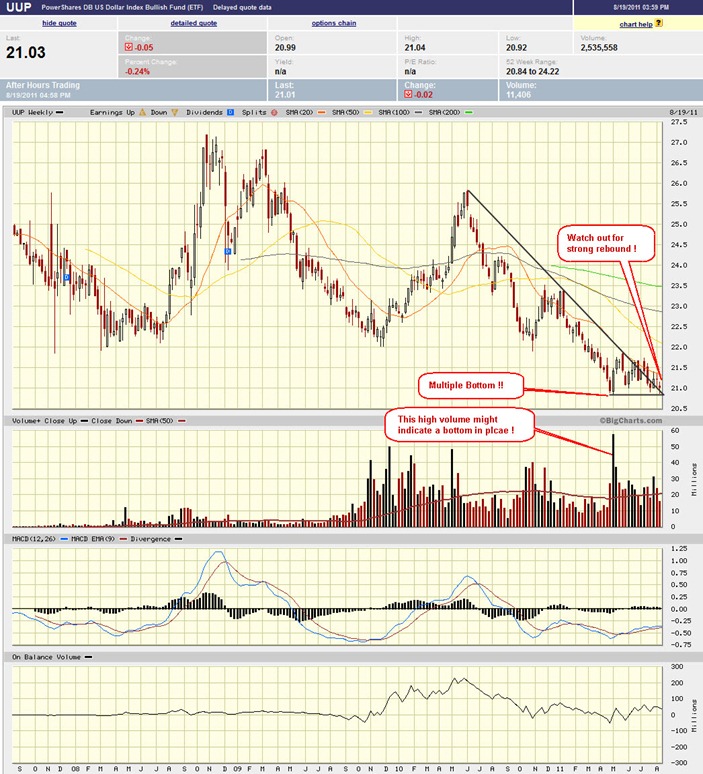
-- UUP making multiple bottom.

-- UNG making multiple bottom.

-- USO making multiple bottom.

-- Many sectors are making double bottom.

-- SPY weekly chart approaching the 2008 crashing line.

-- DJIA weekly chart still has its 200MA line as temporary support before coming into 2008 crash line.

-- NASDAQ is so far the safest. Its weekly chart still has a short distance to its 200MA line and also to the 2008 crash line.

-- VXX weekly charts seem to show hanging man.

-- Expect a short term rebound. However, if market decide to punch through the previous crashing point, be ready to run as fast as you can.

clip_image002

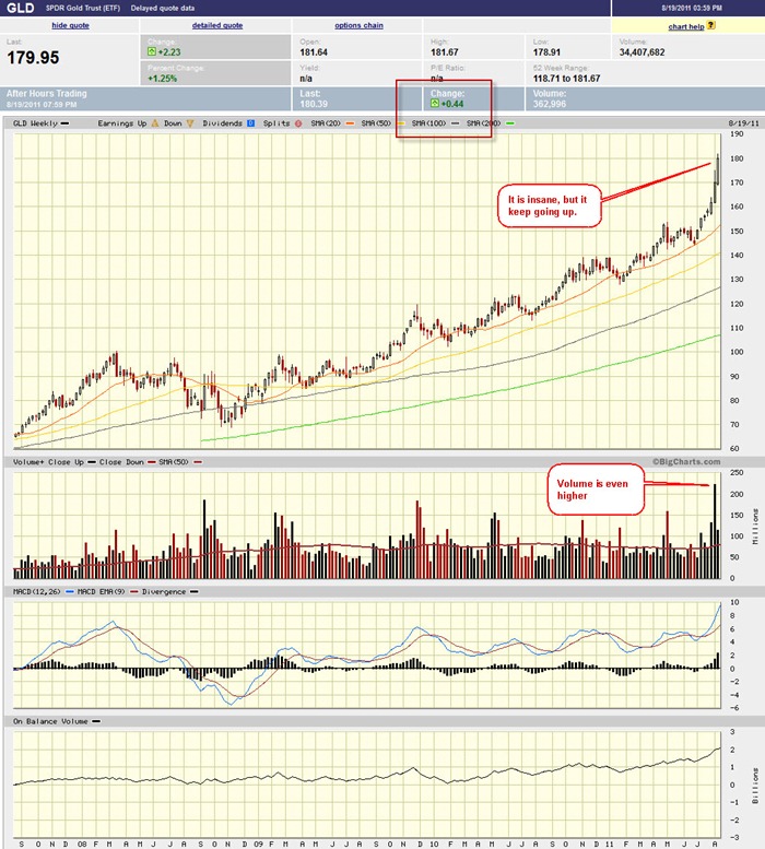
-- GLD making higher move. Either UUP dip down, or market go down, it can still going up both ways.

-- GDP and Housing data on Thursday and Friday, watch out!

-- MACD for all 3 indexes start dipping into negative territory.

-- All 3 indexes are approaching closer and closer to yr 2008 crashing point.


Next Week Economic Data:


clip_image003


Input:


  1. Data on Thursday and Friday should be the main player of the week.
  2. [Added on 23rd Aug] Watch out for Ben’s speech on Friday. That can swing the market heavily.


VXX chart:
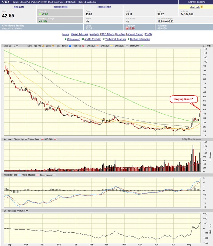
 

clip_image004


Input:


  1. A weekly hanging man formation ??!! Will this bring some rebound back to the market?


SPY chart:
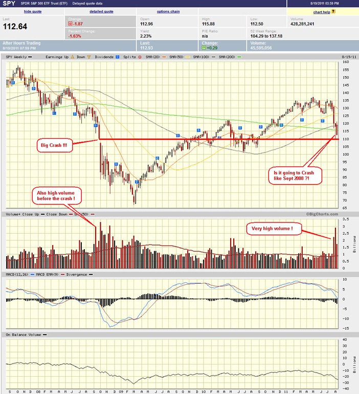
 

clip_image005


Input:


  1. Very near to the 2008 crashing line. Steps away.
  2. Very high volume past 2 weeks.
  3. MACD dipping into negative territory.
  4. Things look pretty similar to 2008 crash.


DJIA chart:
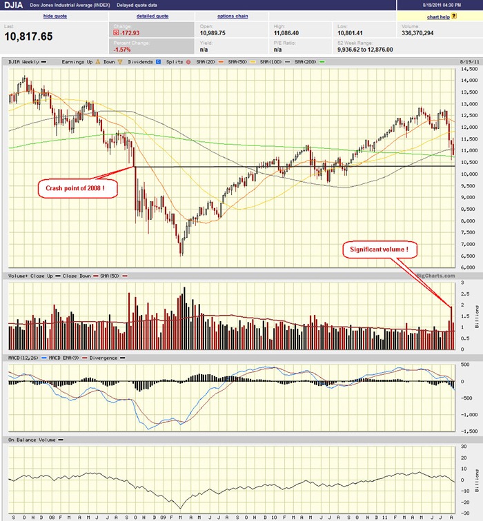
 

clip_image006


Input:


  1. Similar to SPY, but DJIA is in better shape comparatively.
  2. 200MA support line for DJIA is critical.


NASDAQ chart:
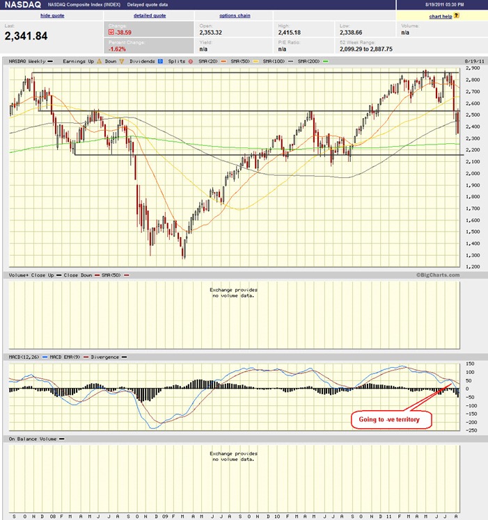
 

clip_image007


Input:


  1. Similar to SPY, but NASDAQ is in better shape comparatively.
  2. 200MA support line for NASDAQ is critical. It still has a better play compare to DJIA.


UUP chart:
 

clip_image008


Input:


  1. UUP is now at tipping point. It may react both way violently.
  2. What is its relationship with GLD now??
  3. UUP up is normally bad for market, GLD will go up. UUP down also will drive GLD higher. Does that mean GLD will keep going up no matter where UUP goes?


Sector Analysis:


clip_image009


Input:


  1. Many sectors are showing some kind of double bottom.
  2. Utility stay strong during bear market.


GLD, SLV, Petrol and Natural Gas charts:
 

clip_image010


clip_image011


clip_image012


clip_image013


Input:


  1. GLD still making all time high.
  2. SLV is making another big rally with low volume.
  3. UNG is continuously making multiple low. 20MA and 50MA lines are merging. Things are getting interesting for UNG. Is now the entry time?
  4. USO is making multiple low again. Expect a rebound.


FXI (iShares FTSE / Xinhua China 25 Index Fund) chart:


clip_image014


Input:


  1. FXI is making multiple low. Standing above its previous crashing point at Sept 2008.


Baltic Dry Index chart:


  • NA


Input:


  1. Not enough time for this.