Sunday, May 6, 2012

6th May 2012 – Let’s go Nevada.

Buy $

Sell $

Short $

Cover $

Stop Loss $

Profit / Losses

Duration


28.21


30.10


temp Reason for Buy / Sell / Short / Cover:


  1. Price has dropped below the neck support line on the weekly chart.
  2. I should have been more patient in my entry. Should have waited for it to come to 20MA line in intraday chart.
  3. Monthly chart shows that the price not only dropped below the neck line support. It is also below the uptrend line now.


Lesson Learnt:


  1. Watch closely the GLD price movement. They are highly correlated.
  2. I should have checked when they will announce quarterly report. Guess what, they will do so on 7th May. Looks like I can be in deep trouble.          ;-)


Intraday Chart

clip_image001


Historical Chart

clip_image002


clip_image003

6th May 2012 – Falling A…APpLe!

Buy $

Sell $

Short $

Cover $

Stop Loss $

Profit / Losses

Duration


585.00


599.00


temp Reason for Buy / Sell / Short / Cover:


  1. After covered from short from previous two days, the price can hardly get up above the 50MA line in intraday chart.
  1. Price has gone down since it last reported its quarter announcement.
  1. More and more counters in my entire watch list are showing downturn.
  2. Price has breached the daily 50MA line.
  3. All secondary indicators in the daily chart are pointing downward.


Lesson Learnt:


  1. I actually shorted it at a much better price last week, but market came out with some good data in the next two days and market started to rally. AAPL share started to rally back and I decided to cover and watch from sideline.
  2. Actually the correct way is to set the stop loss somewhere above the 20MA line.
  1. Don't get panic again this time.


Intraday Chart

clip_image001


Historical Chart

clip_image002

Saturday, May 5, 2012

5th May 2012 – Changing chart type

I have been reading newsletter from MarketWatch everyday and looking at those charts presented by those experts. I started to realized that certain chart type seems to attract me more, especially the OHLC type posted by Kevin Marder.

temp

Hence I have taken a month time to try it out and I think I will start changing from candlestick to OHLC from now on until I decided to change again. Here is the sample that I will start using in my blog.

AAPL -  All_60m 2012-05-05

Friday, April 27, 2012

27th April 2012 – Pattern Study – AH! That hurts.

temp Ticker:


  1. AH


Topic:


  1. The longer you HOPE, the more HOPELESS you are!


Lesson Learnt:


  1. When it is time to accept the fact, take it, don't think! Else it really hurts.


Intraday Chart

-NA-


Historical Chart

 clip_image001


clip_image002

Wednesday, April 25, 2012

25th April 2012 – AVGO… back in business?

Buy $

Sell $

Sell Short $

Buy Back $

Stop Loss $

Profit / Losses

Duration


34.50


Profit

6 Days


temp Reason for Buy / Sell / Short / Cover:


  1. My stop loss point at $34.50 triggered.
  2. Market rally just because AAPL quarter report is much better than expected. AVGO also follow the rally and gave a rebound.


Lesson Learnt:


  1. I was actually thinking of cover @ $32.80, but I was greedy and expect it to drop further to $32.00 which is the next support trend line.
  2. I was also thinking of how to add my short in this ticker.
  3. Anyway, this stock is still a good short candidate, will come back later.


Intraday Chart

clip_image001


Historical Chart

clip_image002

Tuesday, April 24, 2012

24th April 2012 – When you kill Q(kill) Q(kill) Q(kill), you go in fast, you come out quick!

Buy $

Sell $

Sell Short $

Buy Back $

Stop Loss $

Profit / Losses

Duration


11.90


Profit

3 days


temp Reason for Buy / Sell / Short / Cover:


  1. AAPL is going to release its quarter report tonight. I am not going to try going against it. AAPL constitute a big portion of QQQ.


Lesson Learnt:


  1. I might miss the chance to earn BIG, but I don't think I can take the risk to fight against AAPL quarter report.
  2. If AAPL report is bad and the technology sank, I am not sure how to get in to this SQQQ.     ;-)


Intraday Chart

clip_image001


Historical Chart

clip_image002

24th April 2012 – Burning sensation of AZO pain relief.

Buy $

Sell $

Short $

Cover $

Stop Loss $

Profit / Losses

Duration


381.90


Even

One day


temp Reason for Buy / Sell / Short / Cover:


  1. Decided to cover after seeing a strong move upward even though the market is going down to protect my capital.
  2. AAPL is going to report quarter on Tuesday, result is most probably on the +ve side and that can drive the market up easily. Hence it will not be good for  this short.


Lesson Learnt:


  1. My decision at late night was worth every single cents. Price gapped up more than 3% before market today.
  2. It is WRONG to pick this stock to short in the first place. Patient, time will come.


Intraday Chart

clip_image001


Historical Chart

clip_image002

Sunday, April 22, 2012

22nd April 2012 – My Analysis

BULL or BEAR ??


Short term (1 week)

Notes

clip_image001

-- There are just too many data for the market to handle next week.

-- All index daily chart started to broke down from its 20MA and 50MA lines.

-- Both SPY and DJIA daily charts seems to show the formation of Head-n-Shoulder.

-- AAPL stock was hit, creating quite an impact to the market too.

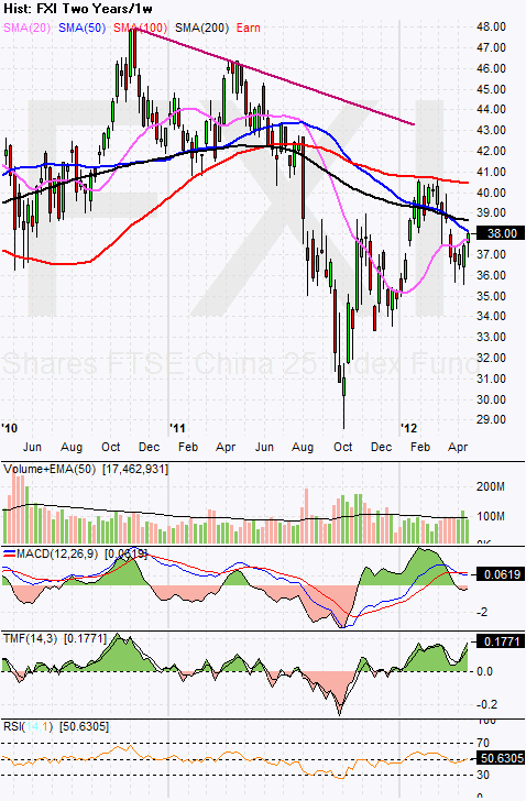
-- FXI is rebounding, but price still remain below the monthly 20MA line.

-- Copper is still weak.

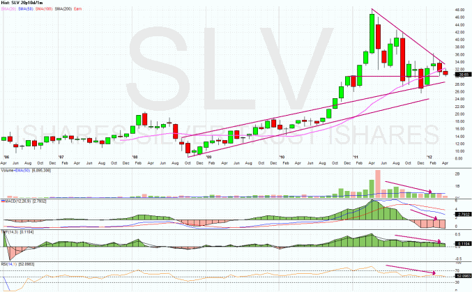
-- GLD and SLV looks weak and could be a candidate for short next week.

-- USO is also getting weaker.

-- Most sectors have indicate the establishment of downtrend.

-- VXX is still circling at its multiple low.

-- UUP is right at the tip of its monthly chart.

-- More and more articles on MarketWatch are indicating bearishness.


SPY (30 years monthly) chart:


clip_image002


Input:


  1. SPY might indicate the end of wave 5. If that is the case, we are going down ---" This is Captain speaking, please kindly tighten your seat belt."


Next Week Economic Data (1 week):
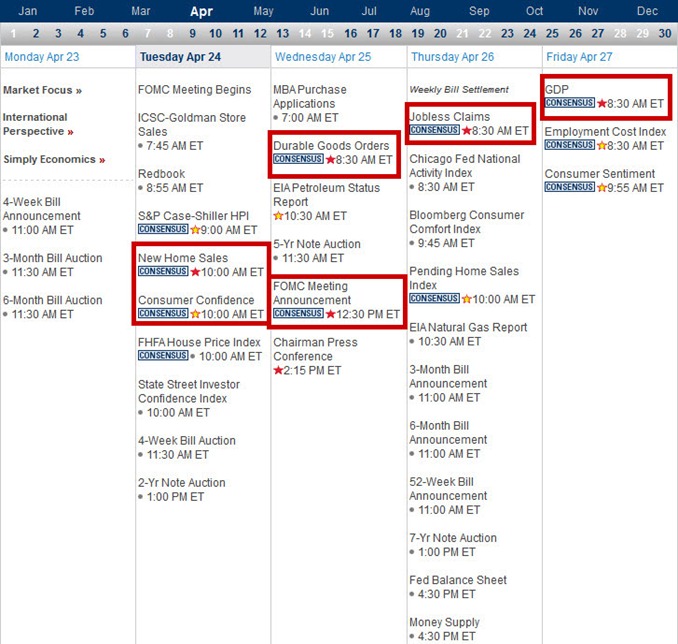
 

clip_image003


Input:


  1. No wonder the stock market is so volatile, there are just too many data to be digested next week.


VXX chart:


clip_image004


clip_image005


clip_image006


Input:


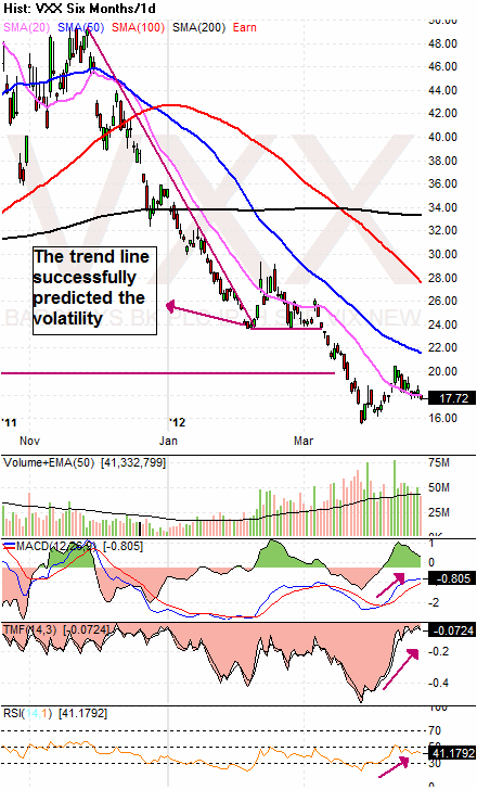
  1. Monthly VXX chart shows that it is sitting on the multiple bottom trend line.
  2. Weekly VXX chart shows that it is resting on the downtrend line.
  3. Daily VXX chart shows that the price has dropped slightly below the 20MA line. However, all secondary indicators are pointing upward.


SPY chart:


clip_image007


clip_image008


Input:


  1. Weekly SPY chart shows that it resting on the previous May 2011 high. However, uptrend line is obviously broken but still maintain above 20MA line.
  2. Daily SPY chart shows its 20MA line started to curve down. Price has broken down not just the 20MA line, but also 50MA line.
  3. All secondary indicators in the daily SPY chart are pointing downward.
  4. A possible top of Head-n-Shoulder could be forming at the top of daily SPY chart with the neck line around 136.00


DJIA chart:
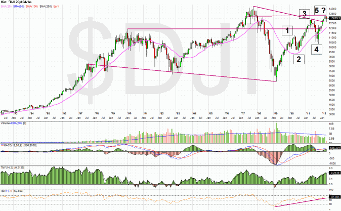
 

clip_image009


clip_image010


clip_image011


Input:


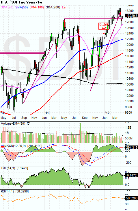
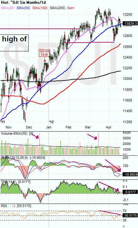
  1. Its monthly chart is similar to SPY chart.
  2. Its weekly chart is also similar to SPY chart except that it is stronger; however, its MACD is starting to do the bearish cross.
  3. Similar to SPY,  all the secondary indicators of DJIA are pointing downward. A possible Head-n-Shoulder at around 12,700.


NASDAQ chart:
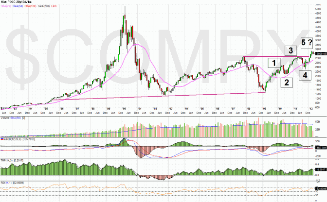
 

clip_image012


clip_image013


clip_image014


Input:


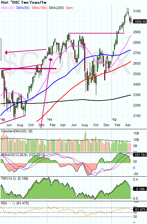
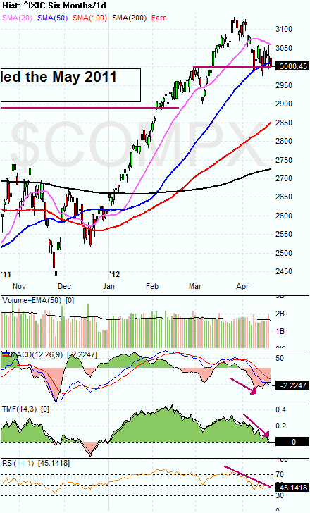
  1. Looks like the damage done by AAPL to NASDAQ is pretty significant.
  2. However, it is still the strongest index among the three.
  3. No obvious Head-n-Shoulder at the daily NASDAQ chart, except the HEAD part.
  4. Price has broken down from 20MA and also 50MA line in the daily chart. It is now resting on the support trend line from the March high.  However, it looks like it can break down anytime now.
  5. All secondary indicators of NASDAQ daily chart are pointing South.


UUP chart:
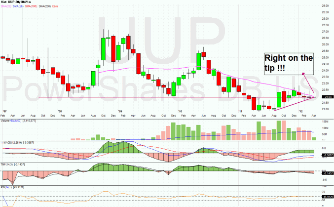
 

clip_image015


clip_image016


clip_image017


Input:


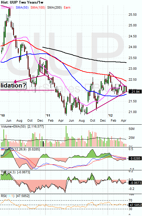
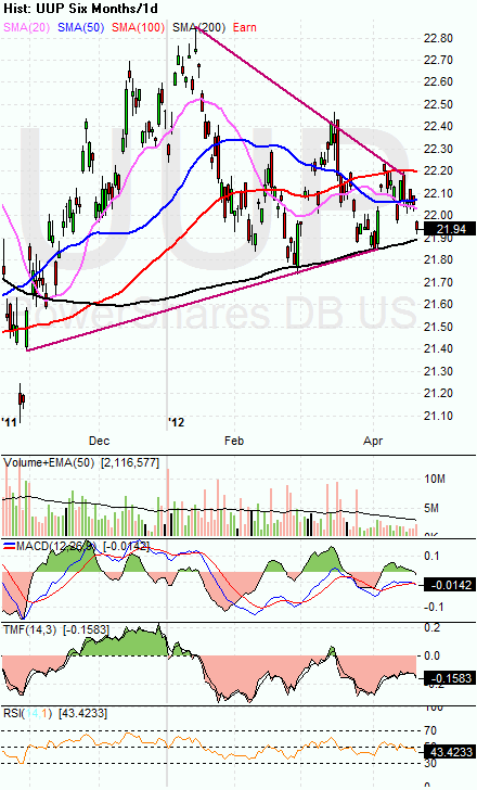
  1. What a fantastic monthly chart for UUP. It is now right at the tip point.
  2. It can be seen clearly that price is still struggling inside the ending part of the triangle formation.


Sector Analysis:
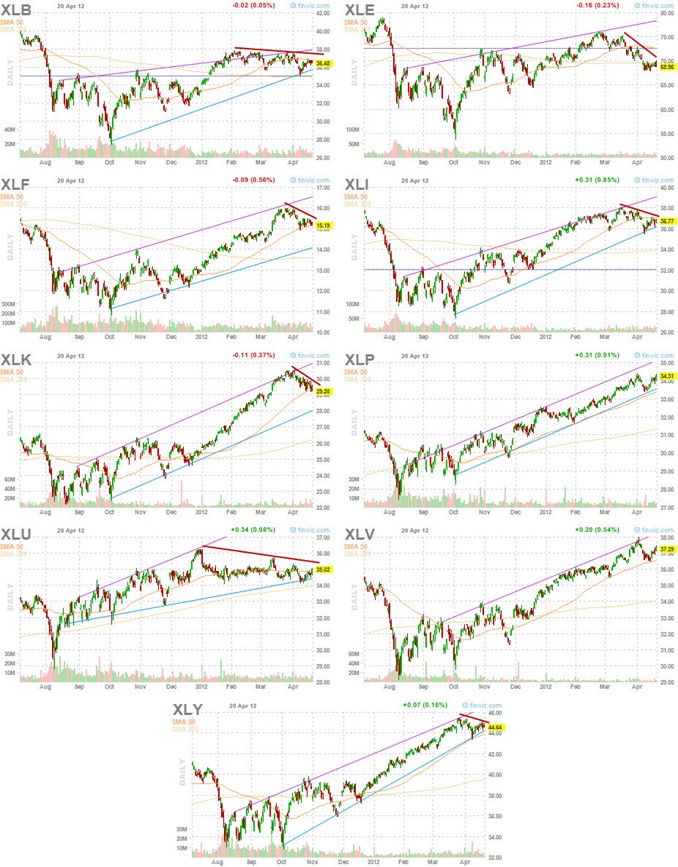
 

clip_image018


Input:


  1. More and more prove of downtrend are starting to emerge for most of the sectors. Even though their main uptrend is still not really broken.


Copper JJC  chart:
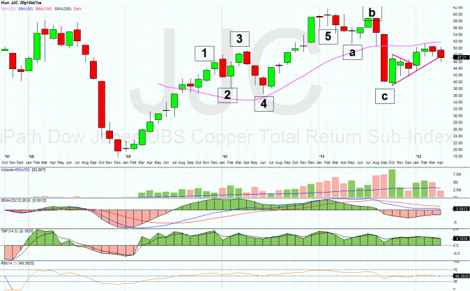
 

clip_image019


clip_image020


clip_image021


Input:


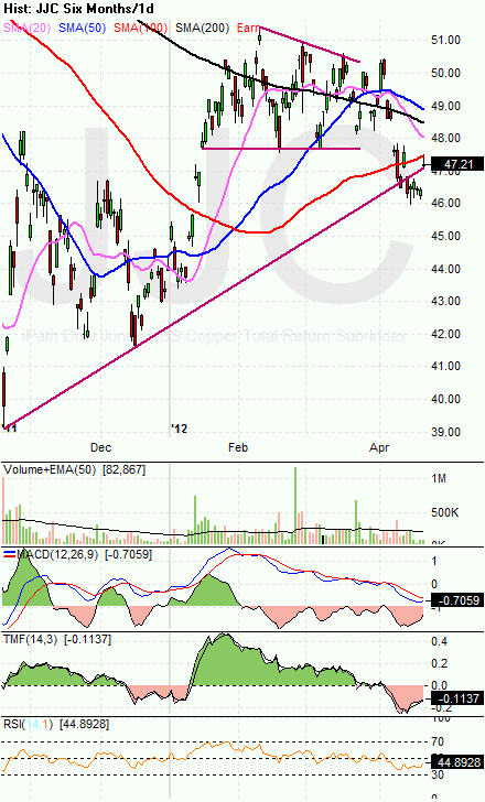
  1. It is clear that Copper is still showing a lot of weakness.


GLD and SLV charts:
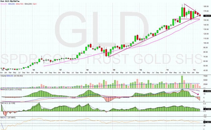
 

clip_image022


clip_image023


Input:


  1. Looks like it is safe to start calling short for both GLD and SLV.
  2. SLV price has fall out of monthly 20MA line. All secondary indicators are all pointing South.
  3. GLD price has started to breach the uptrend line. All secondary indicators are also going South.


 Petrol and Natural Gas charts:


clip_image024


clip_image025


clip_image026


Input:


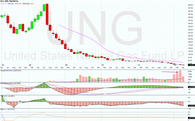
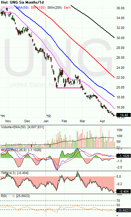
  1. Price still staying above its monthly 20MA line for USO.
  2. There is only one single word for UNG ---- UGLY !!!


FXI (iShares FTSE / Xinhua China 25 Index Fund) chart:
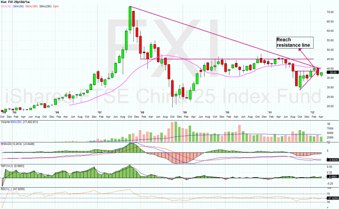
 

clip_image027


clip_image028


clip_image029


Input:


  1. Even though FXI has rebounded recently, on the monthly chart it is obvious that the price is still below 20MA line.
  2. Weekly and daily FXI charts also show that the price is still controlled by its 50MA line.


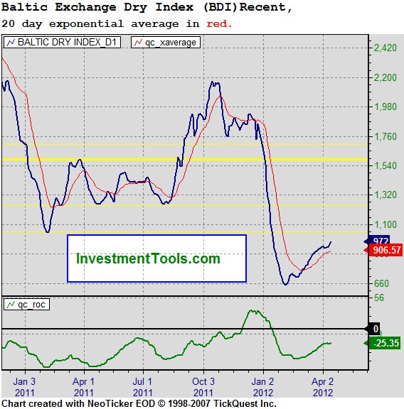
Baltic Dry Index chart:
 

clip_image030


Input:


  1. Shipping index is showing some strength, interesting!