BULL or BEAR ??
| Short term (1 week) | Long term (1 month) |
| -- All 3 indexes weekly chart shows facing resistance at trendline. It makes the short term bounce looks like "dead cat bounce". -- Short term uptrend for all 3 indexes are still intact, but once the MA line and resistance line are broken, it can be real BIG trouble. -- Short term uptrend for all sectors are still intact. -- Baltic Dry Index is getting higher again. Something interesting to take note. | -- All 3 indexes weekly chart plus FXI weekly chart shows that we are still in a Bear market. -- There is no more blocking MA line for VXX anymore. -- UUP is trying to get higher. -- If all 3 indexes broken down from MA line and trend line support in their daily chart, we are going down hard. |
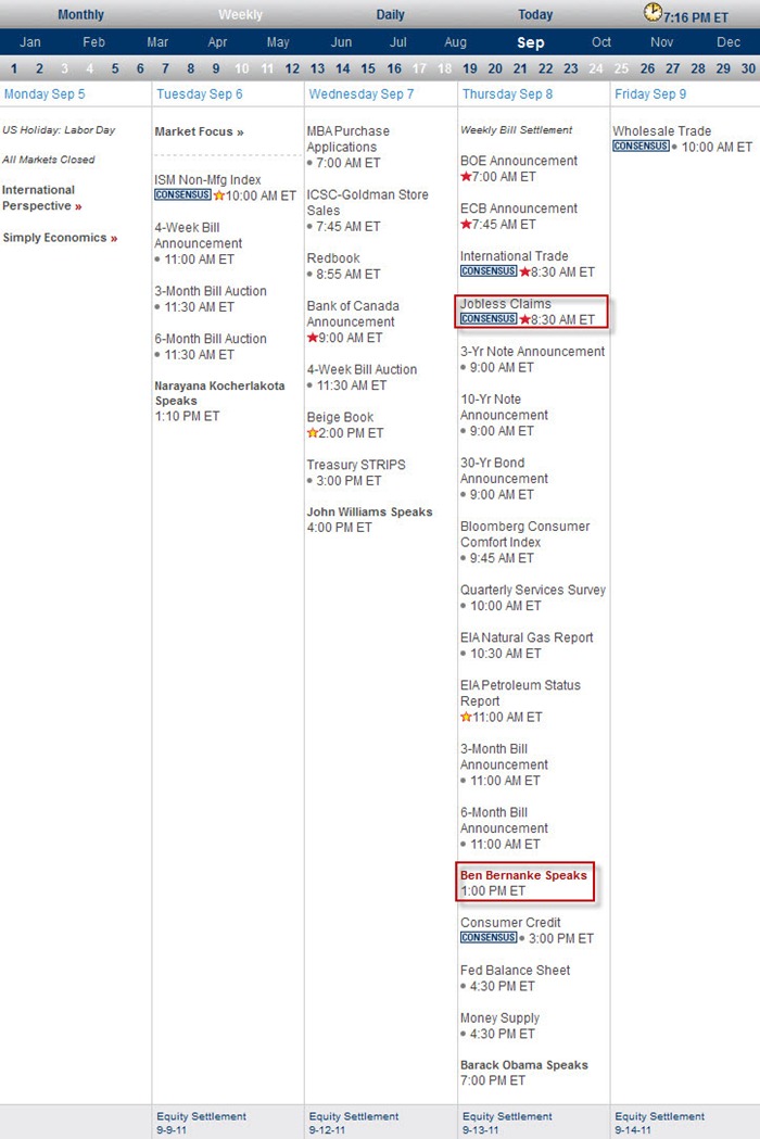
Next Week Economic Data:
Input:
- Not much data except Thursday.
VXX chart:
Input:
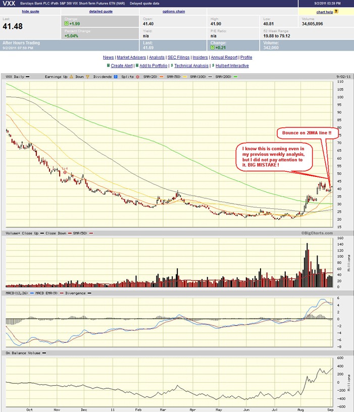
- Predicted this coming in last week analysis, but again I was not paying attention to it.
- It bounced right on the 20MA line and create havoc on Friday.
- Costly mistake, else could have pocket more $$$ on my trades.
- Looks like there is no MA lines is blocking the advancement of VXX anymore.
SPY chart:
Input:
- Big drop (2.55%) but only less than average volume. This is weird.
- Daily chart shows that short term it still has the 20MA line and trend line as support.
- Weekly chart shows that it has bounced into the resistance trend line even though it still has the 200MA line as support.
- Now is a matter to observe how it behaves at the resistance line. Another failure through the 200MA line will really mean BIG disastrous trouble.
DJIA chart:
Input:
- Similar to SPY, DJIA weekly chart shows trouble.
- All these make the short term bounce looks like "dead cat bounce".
NASDAQ chart:
Input:
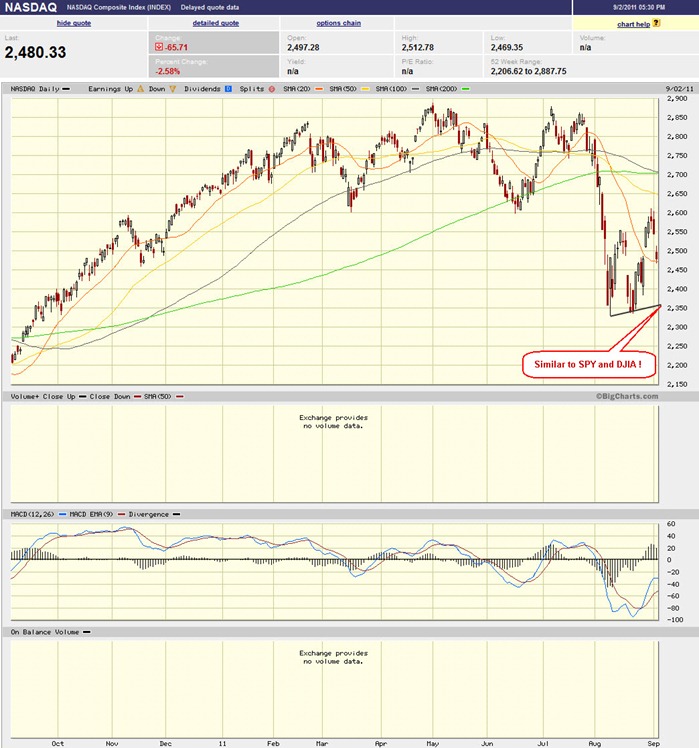
- Similar to SPY and DJIA
UUP chart:
Input:
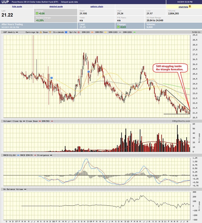
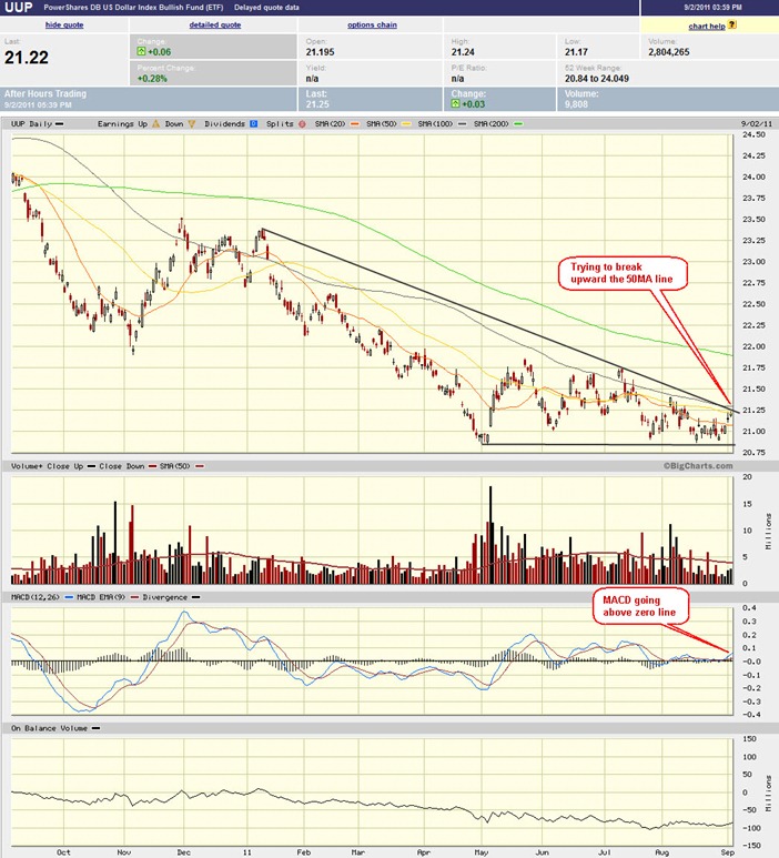
- UUP is still struggling inside the weekly triangle formation in the weekly chart.
- Daily chart shows that MACD is moving up through the zero line already and the price is trying to break upward through the 50MA line.
- This might be bad for stock, but will that mean a bad news for GLD? The relationship between UUP, stock market and GLD is getting harder and harder to correlate especially now everyone is expecting a QE3 in the pipeline.
Sector Analysis:
Input:
- It is clearly seen that all sectors actually gapped down, however the short term uptrend for all of them are still intact.
GLD, SLV, Petrol and Natural Gas charts:
Input:
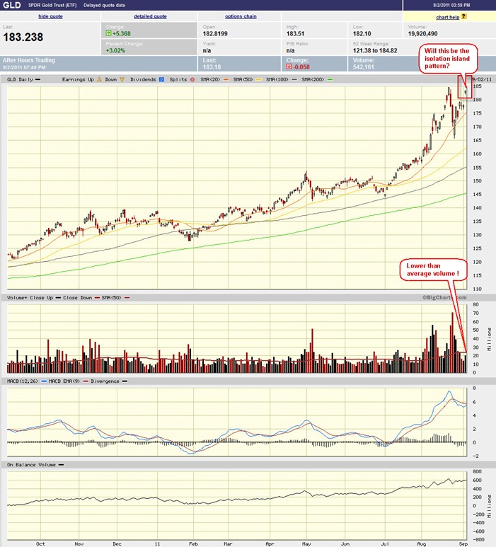
- A gap up of GLD. Could this be the isolation pattern? Watch closely. The volume is below average, this increase the chances of isolation island pattern.
- SLV behaves just like GLD. Potential isolation island.
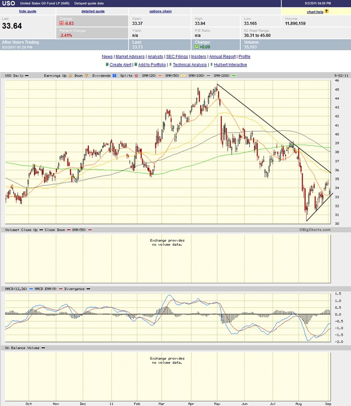
- USO is sitting on the daily 20MA line and the trend line.
- UNG chart is not shown here, but it is not pretty either.
FXI (iShares FTSE / Xinhua China 25 Index Fund) chart:
Input:
- FXI is still weak. MACD digging deeper.
- It is still below all MA lines.
Baltic Dry Index chart:
Input:
- This is not something that we should take lightly anymore. Something is going on here.
- It is time to check out the shipping stocks and see what is coming in the pipeline.

![clip_image001[1] clip_image001[1]](https://blogger.googleusercontent.com/img/b/R29vZ2xl/AVvXsEj060CIRkWprmsZZkfpxoOx8YN0da1nlb7u-YrTGpKKFh5Gka87QlCptuvzHBSwmOJEeddbuGyMXMzpSwnQeWaGicXMs5SwlGEtzp87JMHz2x5x1zCMHMxCWlAnrBEdE1eKzcnI0be_X-0//?imgmax=800)






No comments:
Post a Comment